
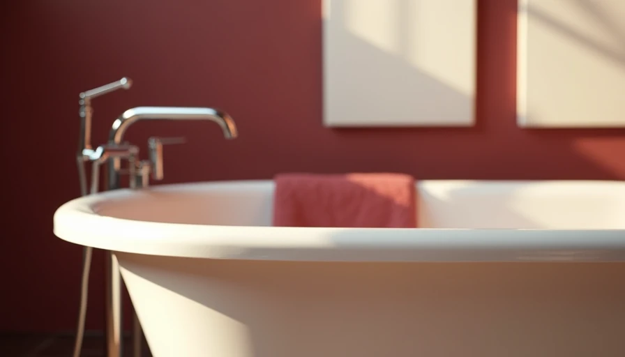
Bath colour is not just a finishing decision. In a small bathroom, it changes how wide the room feels, where your eye lands, and whether the space reads as calm or cramped. After designing more than 80 bathrooms across Los Angeles County, I have learned that the best color scheme is rarely the palest one available. It is the one that gives every surface a job.
A 5-by-7 bathroom has very little visual distance between the floor, walls, vanity, shower, and mirror. That makes contrast powerful, but it also makes random contrast look busy. The goal is not to eliminate color. The goal is to control where it appears.
Start with the room’s fixed elements
Before buying paint, photograph the tile, countertop, floor, and plumbing finishes in daylight. A white porcelain floor can have a cool blue undertone, while a supposedly neutral beige tile may lean pink or yellow. Your bath colour should respond to those existing materials instead of competing with them.
If the floor is warm gray, a soft mushroom, putty, or muted sage on the walls can make it feel intentional. If the tile is crisp white, consider a chalky blue, dusty clay, or deep ink vanity for contrast. The popular all-white bathroom works best when the whites are deliberately matched. Three different whites, especially under warm LED bulbs, can make a compact room look unfinished.
I usually limit a small bathroom to three visual families: the main wall color, the hard-surface color, and one accent. Brushed brass, chrome, or matte black counts as an accent even though it is not technically paint. That simple rule keeps a narrow room from becoming a sample board.
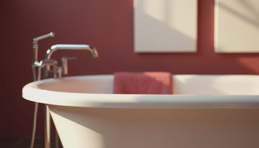
How to choose a bath colour by light
Light direction matters more than a paint card suggests. A north-facing bathroom tends to flatten cool colors, so a warm white such as Benjamin Moore White Dove or Sherwin-Williams Alabaster can keep the room from feeling gray. In a sunny south-facing room, those same colors can become creamy. A quieter gray-green or blue-gray may provide better balance.
For bathrooms without a window, avoid choosing color under a single overhead fixture. Tape sample boards on two walls and look at them in the morning, evening, and with the lights on. Paint directly on the wall can be misleading because the existing color shows through, and a sample board can move around the room as the light changes.
The finish matters too. Use a washable eggshell or satin finish on painted walls, depending on the product and moisture level. Ceilings can stay matte, but a slightly lighter ceiling often helps a low room feel taller. Do not use a high-gloss finish everywhere to create brightness; reflected glare can make a tiny bathroom feel harder and more cluttered.
Three color strategies that work in 5-by-7 bathrooms
The first strategy is tonal: use close variations of one color across walls, tile, and cabinetry. A pale greige wall with a slightly deeper taupe vanity and warm white tile creates depth without obvious stripes. This is especially useful when the bathroom has a pedestal sink, exposed toilet, or limited storage, because the background stays visually quiet.
The second strategy is a dark anchor. Paint the vanity a saturated shade such as Farrow & Ball Hague Blue, Benjamin Moore Newburyport Blue, or a charcoal green, then keep the walls and floor lighter. A 24-inch vanity can carry a surprisingly strong color without swallowing the room. The mirror and lighting should be simple so the cabinet feels intentional rather than theatrical.
The third strategy is a single-color envelope. Continuing one bath colour onto the walls and ceiling can blur the corners and make the room feel more architectural. This is particularly effective with dusty rose, muted olive, clay, or a soft blue. I would skip this approach with an extremely bright primary color unless the room receives excellent natural light; intense color on every surface can become tiring quickly.
Tile, grout, and the mistakes I see most
Tile often occupies more square footage than paint, so it should lead the scheme. In a shower, a 2-by-8-inch tile creates a different rhythm from a 4-by-4-inch square, even when both are white. A vertical stack can emphasize height, while a horizontal layout can visually widen a narrow shower wall. Neither is automatically better; the proportions of the room decide.
Grout is a quiet but important bath colour decision. Matching grout makes tile read as a single plane, which can help a small shower feel larger. Contrasting grout highlights every joint and gives a handcrafted or graphic look, but it also adds visual information. With small-format tile, that information can overwhelm the room. I often choose a grout one shade darker than the tile for definition without a checkerboard effect.
A common mistake is selecting a trendy green or terracotta tile before checking its relationship to the floor. Another is adding colorful tile, colorful paint, patterned wallpaper, and colorful towels all at once. Pick one lead moment. Let the other surfaces support it.

Affordable ways to test the look
You do not need a full renovation to improve the color story. A new vanity front, painted medicine cabinet, shower curtain, bath mat, or framed mirror can establish a direction for under a few hundred dollars. If the existing tile is sound, leave it in place and work around it. Replacing a faucet or light fixture can also shift the perceived temperature from cold and clinical to warm and residential.
For renters, removable wallpaper can bring pattern behind a vanity or on the wall opposite the mirror, but check the manufacturer’s moisture guidance before using it near a shower. A painted ceiling is another low-commitment move. Even a muted color on that fifth wall can make a basic bathroom feel designed rather than merely maintained.
Buy a real sample pot when possible, and test the paint beside the trim, tile, and metal finishes. A $12 sample is cheaper than repainting 40 square feet twice. If you are comparing two shades, place them on separate boards rather than side by side on one wall; colors influence each other strongly when they touch.
A practical decision sequence
Begin with the element you are not replacing. That might be terrazzo flooring, a rental-grade vanity, or dated cream tile. Find its undertone, then choose a wall family that supports it. Next, decide whether the room needs continuity or contrast. Continuity makes awkward corners less noticeable; contrast gives a plain room a focal point.
After that, select the metal finish and lighting temperature. Warm bulbs can make cream, pink, and terracotta feel richer, while cooler bulbs can sharpen blue and green. Choose bulbs in the same general temperature throughout the room so the vanity does not look yellow while the shower looks blue.
Finally, bring in textiles and accessories. Towels are inexpensive, but they should repeat a color already present rather than introduce a fourth unrelated shade. A walnut stool, woven basket, or framed print can add warmth without adding another major color block.
The right bath colour will not create extra square footage, but it can make the existing dimensions work harder. In a 35-square-foot powder room or a standard 5-by-7 bathroom, disciplined color creates the visual breathing room that expensive finishes often promise. Start with the fixed elements, test samples in real light, and choose one surface to be memorable. That is how a small bathroom becomes specific, useful, and genuinely yours.